IoT Exploratory Tutorial

Click here to download the PDF version of this tutorial.

Introduction to the Exploratory

The Exploratory tool is the power behind the IoT Exploratory resource. It is the location of the entire IoT device ecosystem data, and where the data can be visualised and analysed. On offer are multiple device selecting and visualisation options, as well as analytical tools for basic and advanced use cases.

When the Exploratory tool is first opened, a world map displaying IoT device locations can be viewed. This map can be utilised by a zoom in and out function allowing users to visually search locations to find the available devices.

Below the map feature are 3 data tab options, ‘Select Live Data’, ‘Get Selected Data’, and ‘Select Historic Data’. See figure 1.

By default, ‘Select Live Data’ this selected. This tab displays all live IoT devices available within the ecosystem. Figure 2

Sorting and filtering options are also available. Using the buttons as seen in figure 1, the options can be selected.

Figure 1

Figure 2

Device Buttons

Each device as seen in figure 3 has 5 button options on the left side. The functions of these buttons are explained below.

Information about the device will be displayed, including a map showing the device’s geographical location.

Build a 1-week data set for the device which includes all device sensors. A 15-minute interval is used by default.

Generate a live 24-hour dashboard. This is explained in the ‘Building a Dashboard’ section below.

Expand a list of all sensors within the device. These sensors can be selected or deselected depending upon requirements. See figure 3.

’Add Device’ to the ‘Selected Devices’ list. This is explained further in ‘Building a Data Set’ section below.

Figure 3

Building a Dashboard

The Exploratory tool offers two data visualisation options, time series data sets and dashboards. The dashboard function enables live data over a 24-hour period to be viewed. This 24-hour period of data will update at regular intervals relating to the type of device. For example, an IoT Weather Station dashboard will display data over 24-hour period that updates every 15 minutes. By selecting the ‘Generate a Dashboard’ button on the device chosen, a dashboard will be created.

How can this be used in the classroom? A common use case for the classroom is to dedicate a computer and monitor to displaying the dashboard data of a device located at the school. If the device chosen was an IoT Weather Station located at their school, students could view the current and local environmental readings.

Figure 4

The example in figure 4 shows a dashboard generated of an IoT Weather Station located in Scotland, UK.

Selecting a Time Series Data Set

To this point the tutorial has covered how to see live devices, how to use most of the device buttons and how to build a dashboard. The next step is to select and build a time series data set from one or multiple devices.

With the Exploratory tool open and using the ‘Select Live Data’ tab, all live devices can be viewed. These devices can be sorted and/or filtered to requirement. Once a device has been chosen there are two ways to build a time series data set. The first, select the ‘build a 1-week data set’ button. This will automatically build a data set for all sensors of the device for a 1-week period.

The second, is to manually add the device to the ‘Selected Devices’ list. This option allows multiple devices to be included in the data set. To add a live device to the ‘Selected Devices’ list, simply selected the ‘Add Device’ button as shown in ‘Device Buttons’ section. The device will now be added to the list which can be viewed below the sort/filter buttons. See figure 5. To add a second device, repeat the process.

Devices can be removed from the ‘Selected Devices’ list be selecting ‘Remove’.

Figure 5

Building a Time Series Data Set

Devices have now been selected; the next step is to build the time series data set.

Firstly, the ‘Get Selected Data’ tab needs to be open. See figure 6. In this tab the time period for data set is chosen and the data point interval.

By default, a 24-hour period is inputted into the time series range. This can be adjusted by selecting a start and end date as well as a start and end time.

Next, a data point interval for the time series must be chosen. A maximum number of 1500 data points per sensor. Unavailable options are greyed out.

Once the range and data point interval have been chosen the ‘Generate Graphs’ button can be selected.  The data set will now be generated.

Figure 6

Building an Example Data Set

To this point the tutorial covers how to search available live devices in the IoT Exploratory ecosystem, how to build data sets in the form of a dashboards, and how to build time series data sets. The next step is to understand how these data sets can be visualised and analysed in ways which inspire innovative thinking and decision making.

A data set needs to be built using the following criteria. Make use of the filter options to make the searching process simpler.

If the instructions are not clear the data set can be accessed by clicking here.

The URL generated for each data set is unique to the that data set. Therefore, these URLs can be saved and reused in future resource planning.

Devices to Select

  • Downside School Roberts Tower – Weather Station.
  • Singapore NIE Raingarden – Weather Station.

Start Date and Time – 28/09/2020 @ 12:00.

End Date and Time – 16/11/2020 @ 12:00.

Data Point Interval – 1 Hours.

Graphing Toolbox

Once the data set has been generated the graphs page will open. The ‘Graphing Toolbox’ appears at the top of the page. Here all sensors included in the devices will display. These can be selected to go immediately to their respective graph. Also, in the ‘Graphing Toolbox’ is a map displaying the geographical locations of the selected devices

Sensor Graph

Next, are the sensor graphs. These graphs are a time series. This means the x-axis is time, which relates to the time range chosen when building the graph.

By hovering the cursor over the graph, the data point values can be viewed. See figure 7.

The x-axis can be adjusted to closely analyse specific data points within the graph. This is done by moving the start and end cursors of the graph timeline. See figure 8. The y-axis constitutes the sensor value range

Figure 7

Figure 8

The key to right of the graph displays each device included on the graph. The devices can be deselected to remove them should a single device data set wish to be viewed. See figure 9.

Figure 9

Chart Tool

The Exploratory has multiple types of analytical tools. These can be used for augmenting graphs and data, comparing multiple sensors on the same graph, adjusting time zones, and more. The first tools available are the chart tools. By default, this tab is open with the tolls visible. The chart tools allow the graph visual to be altered along with the option to choose a different chart type.

The scatter chart controls can show each data point or not. The figures below illustrate each option.

Figure 10

Figure 11

Figure 12

The graph type options allow the graph to be altered. The options available are ‘Scatter Graph’, ‘Histogram’, and ‘Map’.

Plot Tools

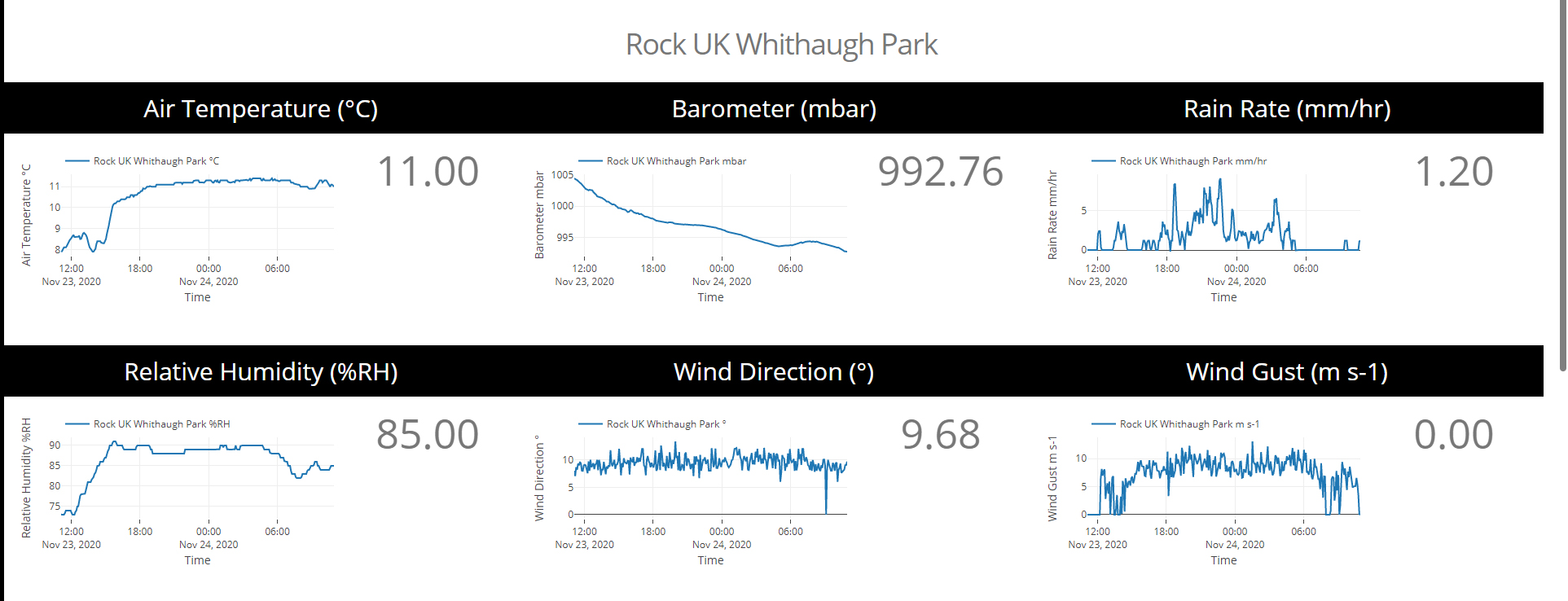
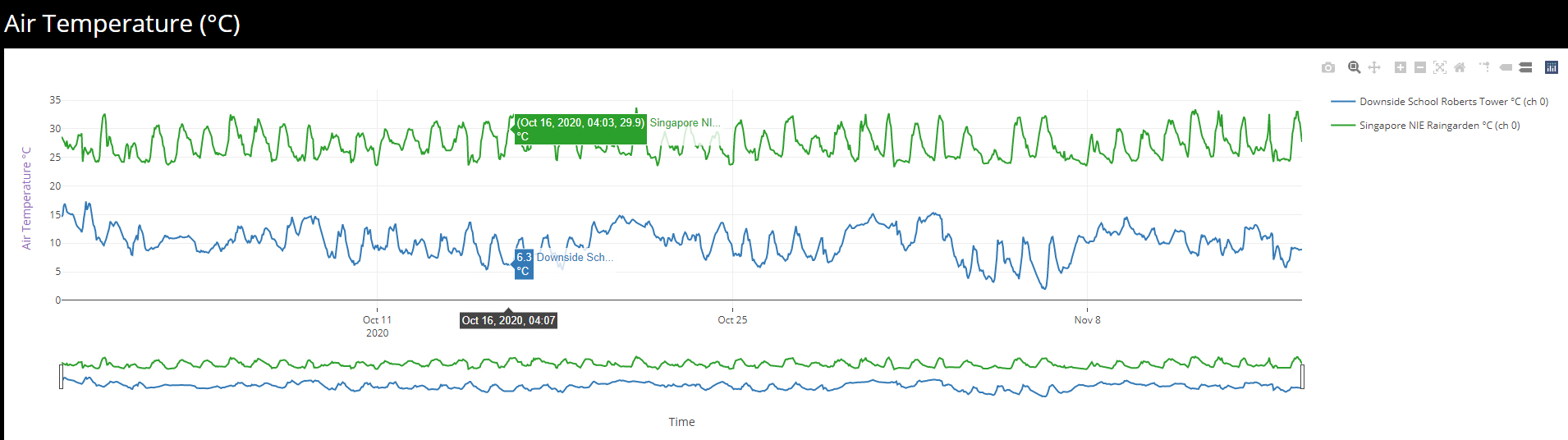
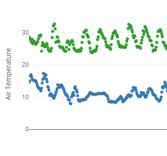
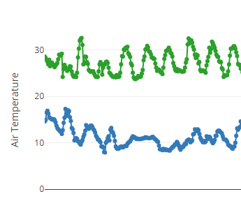
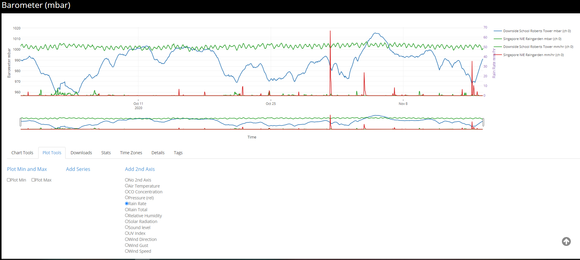
The second tab of analytical tools is the plot tools. For this example, scroll to the Barometer sensor graph. An initial observation between barometric pressure between the two countries is in Singapore there is a pattern and daily oscillation, whereas in the UK there is no pattern. This is where the plot tools can help explain relationships between weather systems around the world.

In the plot tools tab, there are three tool headings: ‘Plot Min and Max’, ‘Add Series’, and ‘Add 2nd Axis’. For this example, the ‘add 2nd axis’ tool will be used. This tool allows a second sensor graph to be overlayed onto the existing graph. Giving the option to compare relationships between different sensors within the data set. All the remaining sensor options within the data set can be viewed in the tool.

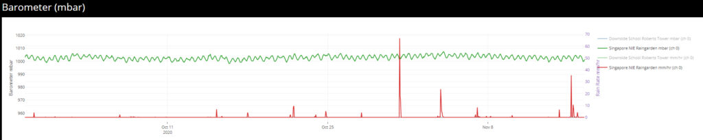
In the UK it is widely known as the barometric pressure drops, particularly if there is a sharp drop, rain is more likely. This can be proven using the plot tools whilst also making a comparison to the effects in Singapore. The ‘Rain Rate’ sensor should be selected. See figure 13.

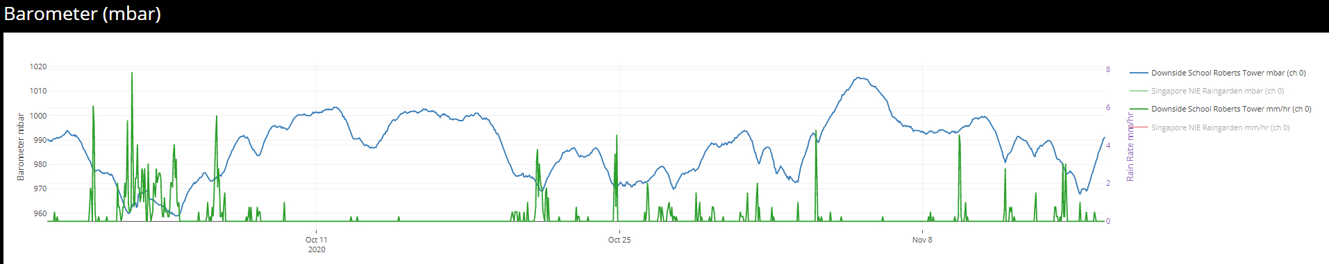
A rain rate graph will now be overlayed onto the barometer graph. Both graphs use the same x-axis, however the rain rate y-axis appears to the right of the graph. If the Singapore barometer and rain rate data are deselected in the key, only the UK data will show on the graph. See figure 14. It shows the drop in barometric pressure increases the likelihood of rain.

Figure 13

Figure 14

By contrast, a correlation does not exist between barometric pressure and rain rate in Singapore.

Figure 15

This exercise uses the data to prove how weather systems work around the world, offering pupils the opportunity to understanding the world around them through data can be inspirational in their perceptive of what is possible with technology.

Downloads

Data from each sensor can be downloaded in different file formats depending upon the use case. The downloads tab includes three file type options.

Figure 16

Stats Table

Visualising data in graph form can tell a story or prove a theory, however, it is often necessary to view the raw statistics behind the data. Using the stats tool a table of statistics can be built.

To illustrate a working example of the stats tool, scroll to the ‘Relative Humidity’ graph. Pupils who are fortunate enough to have travelled to both the UK and Singapore can make a first-hand comparison of their perception of the humidity level in both locations. An assumption often made is Singapore is far more humid than the UK. Looking at relative humidity graph that assumption is called into question. The graph does not clearly show Singapore to have a higher relative humidity than the UK. Potentially the UK is more humid on average.

Using the stats tool the raw statistical data can be viewed and conclusions built. The statistics table built shows the mean, median, and mode. The minimum and maximum values. The range and the standard deviation. Taking the mean value from both locations, (the total value of all data points / the number of data points), shows if fact, the UK has higher humidity on average.

Figure 17

Time Zones

Comparing data around the world can be difficult due to time zone differences. With the IoT Exploratory designed to be globally it is essential for a tool to be available to adjust time zones accordingly. Under the time zones tab, a tool is available for manually adjusting the data on each device. Subsequently, data can be analysed using the same time periods.

An example of the time zone tool in use can be seen with this data set. As used to illustrate the stats table tool, the relative humidity graph is used for this example. Humidity levels often vary throughout a 24-hour period, with higher humidity at night and lower humidity during the day. The relative humidity in its original state is built using the time zone of the machine it is generated on. In this example the time zone used is GMT +0. Therefore, the Singapore data is 8 hours ahead of the UK data.

Using the time zone tool 8 hours can be added to the Singapore data by selecting the + symbol eight times. This shifts the Singapore data into the same time zone as the UK data, comparing like for like data. Zooming into the data as seen in figure 18 illustrates the tool well.

Figure 18

Users are encouraged to spend some time using the IoT Exploratory so they feel comfortable with the tools available.

Keep in Touch

Keep up to date with new IoT Exploratory features and devices, training sessions, other news and events.