Now that you understand how the tutorial features work lets begin by generating some data in graph form using the IoT@School Exploratory.
There are 2 steps involved in generating your data in graph form;
- Selecting a device(s) and sensors
- Selecting your time series (Start and end times) and data point interval
To begin you will need to open the exploratory by selecting exploratory from the menu.
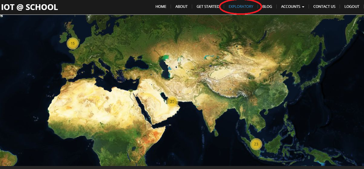
The Exploratory
The IoT@School exploratory is the state of art big data tool used for storing all IoT@School device data from around the world as well as having the capability to generate graphs, live data and offer multiple data analytical tools.
Selecting a Device(s) and Sensors
Device Options
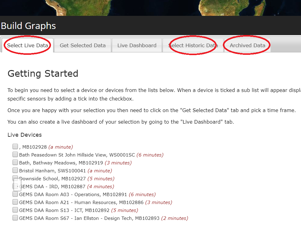
There are 3 options available for selecting one or multiple devices;
- Live Devices
- Recent Devices
- Historic Devices
These device lists can be selected within the build graphs function. See image to the left.
Live Devices
These devices have a most recent data upload within the last 30 minutes.
Recent Devices
A device is labelled ‘recent’ if the latest data upload occurred between 30 minutes and 24 hours.
Historic Devices
If a device has not uploaded a data point within the last 24 hours it becomes a ‘historic’ device.
*For the purpose of this tutorial we will show how to generate data from live and historic devices but not archived devices.
Choosing a Device
- Select live data devices button from the build graph menu as shown in the previous image
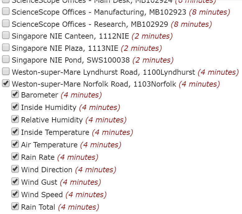
- You will see a list of devices that are currently live similar to what is shown in the image to the right.
- Note that the list of live devices/data will be changing regularly so your list will most likely be different to that shown in the image.
- Choose one or multiple devices by checking the box next to the device name.
- This will then show the available sensors for that device. There is a pre-select of sensors that the system automatically selects depending on the device type but you can check or un-check as many sensors as you wish.
Selecting a Time Series and Data Interval
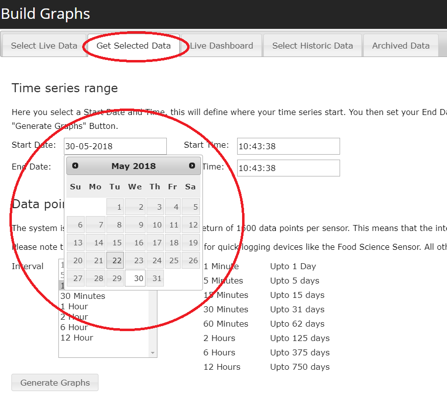
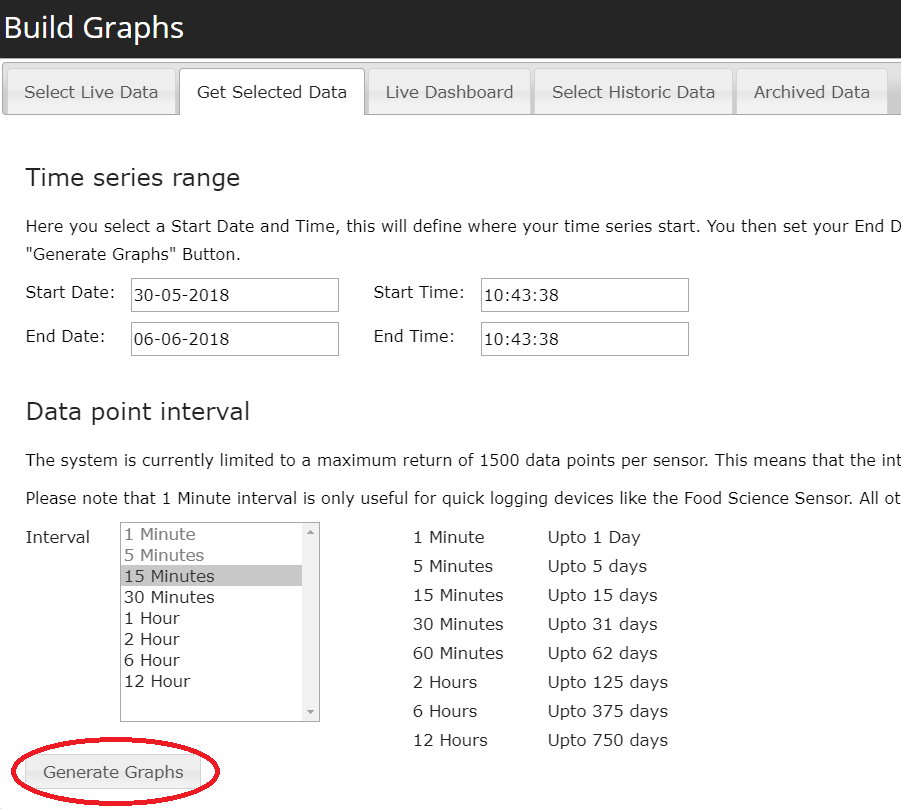
- Select the “Get Selected Data” tab from the build graphs menu.
- You will notice that there are two sections; “Time series range” and “Data point interval”. The first step is to choose the time series range of data you wish to view from your selected device(s).
- Begin by selecting the start and end date of the time series. You can do this by selecting the date boxes which will make a calendar appear.
- The exploratory automatically sets the time series range to the last 24 hours of data.
- If you wish you can also change the start and end time again by selecting the boxes and choosing your desired time.
- Next you must choose your data point interval. This is the time between each point of data on your graph. There is a limit on the maximum number of data points that can be generated in a graph. These are outlined next to the interval box.
- Finally select the “Generate Graphs” button at the bottom of the page and your graph will begin to load.

