Once you have selected the “Generate Graphs” You will taken to the graphing window. This window shows a graph for each sensor selected in previous data window.
This section of the tutorial will show you how to navigate and use the graph window to view the data from your selected devices.
Graphing Toolbox
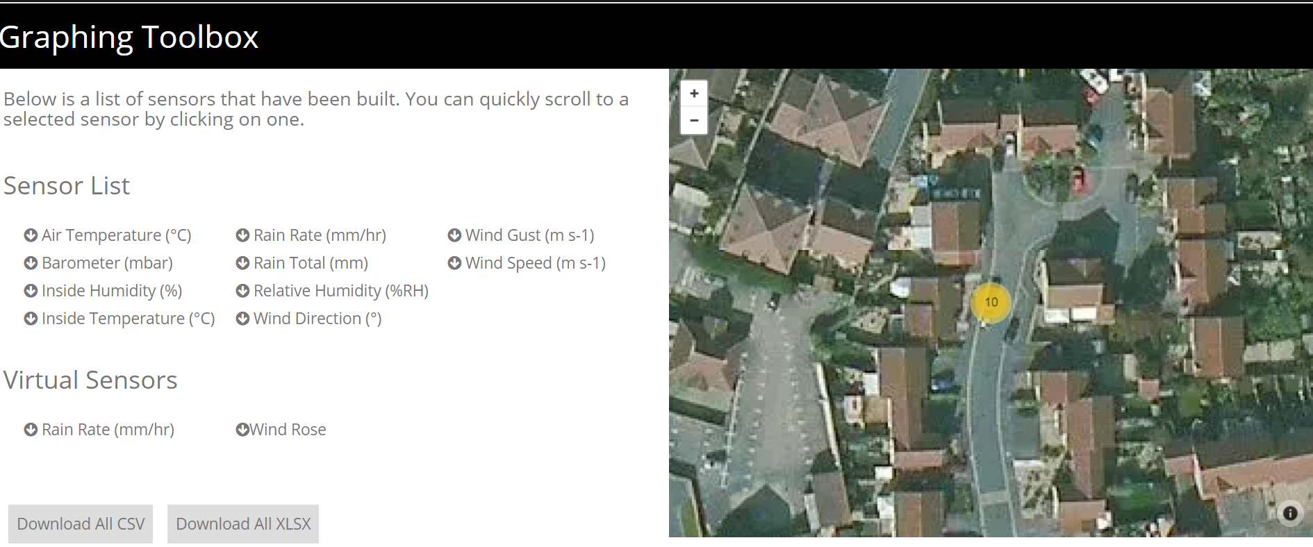
Firstly you will see is the graphing toolbox. This is split into two sections; the sensor list and the map.
The sensor list shows all sensors included in this graph window.
The map shows the location of the device(s) selected.
You can also download all the data from the devices in CSV or XLSX form by selecting the buttons in the sensor list window.
Graph
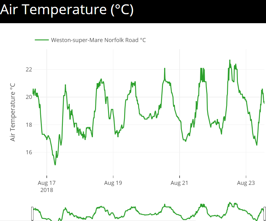
Further down the page you will come to the sensor graphs and graphing tools.
This example shows the air temperature over the course of a week of a UK based weather station situated in the south west.
To view the individual data points you need to hover the cursor over the graph at the point at which you want to view.
There are also some graph viewing tools which can be seen by hovering the cursor over the graph. These include zoom, pan, graph image and others.
Graph Tools
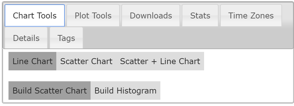
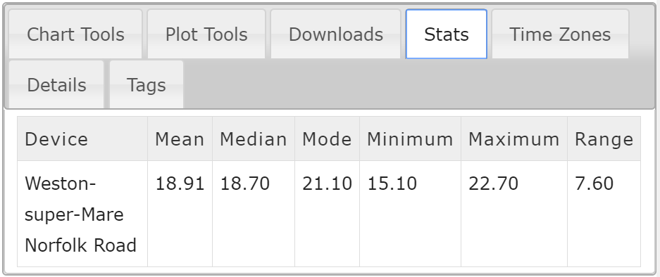
To the left of each sensor graph are the graph analytical tools. These tools help with data analysis of multiple sensors and devices in multiple locations around the world.
The tools on offer range from data point tools to time zone adjustments to data download functions.


Plot Tools

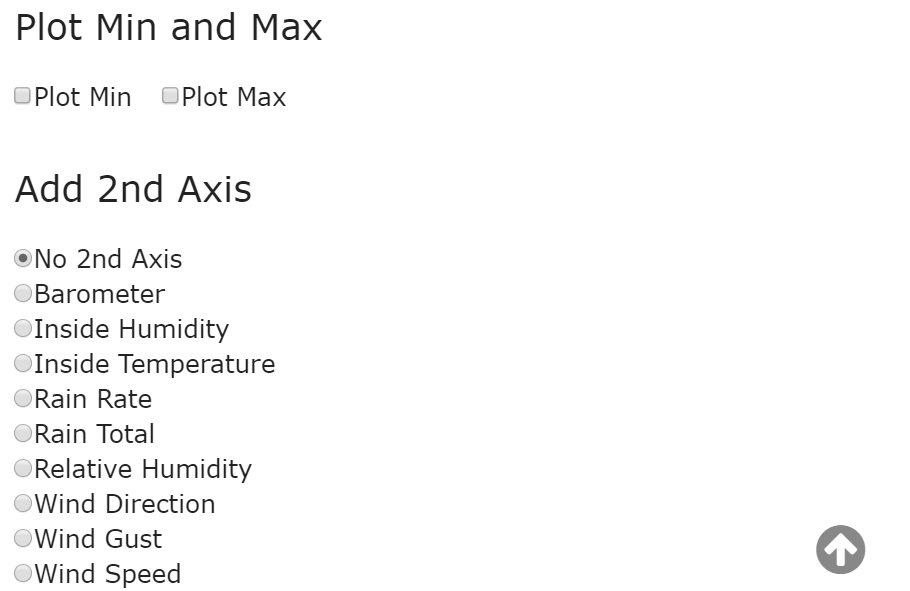
The plot tool allows a second axis to be added to the sensor graph. This can be used to compare two different sensors from the same device to see correlations between the two.
Above is an example of how the plot tool works. The original graph used is barometric pressure and the second axis added is rain total. The second axis appears to the right of the graph.
This graph shows how a drop in barometric pressure increases the likelihood or in this case the quantity on rain caused by the drop in barometric pressure.
Time Zone Tools

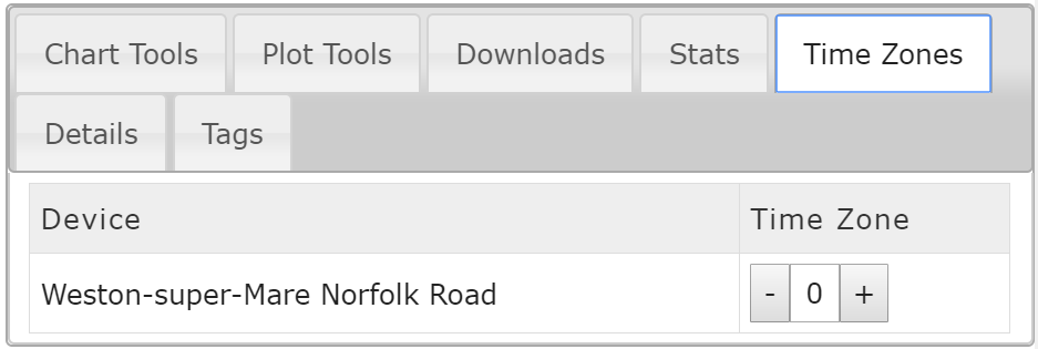
The time zone tool allows time zone adjustments of one or more sensors on the graph. This tool is used when devices are selected in different time zones around the world.
When multiple devices are selected they are adjusted automatically to your local time. The example above shows the relative humidity of a weather station in the UK and a weather station in Singapore. Local time is UTC (GMT+1) which means that the Singapore weather station is 7 hours ahead of the UK weather station.
To make the time zone adjustment to the Singapore weather station you need to select the time zone tab and then increase the time zone to +7. This will adjust the Singapore weather station to the same time of day as the UK weather station.
This will move the graph as you change the time zone so now the data between the two locations can be analysed correctly.

